Diamond View Analytics
A baseball performance-analytics platform that maps hundreds of pitching and hitting statistics onto 20-plus visualisation types, with a conversational AI coach that helps users read the numbers
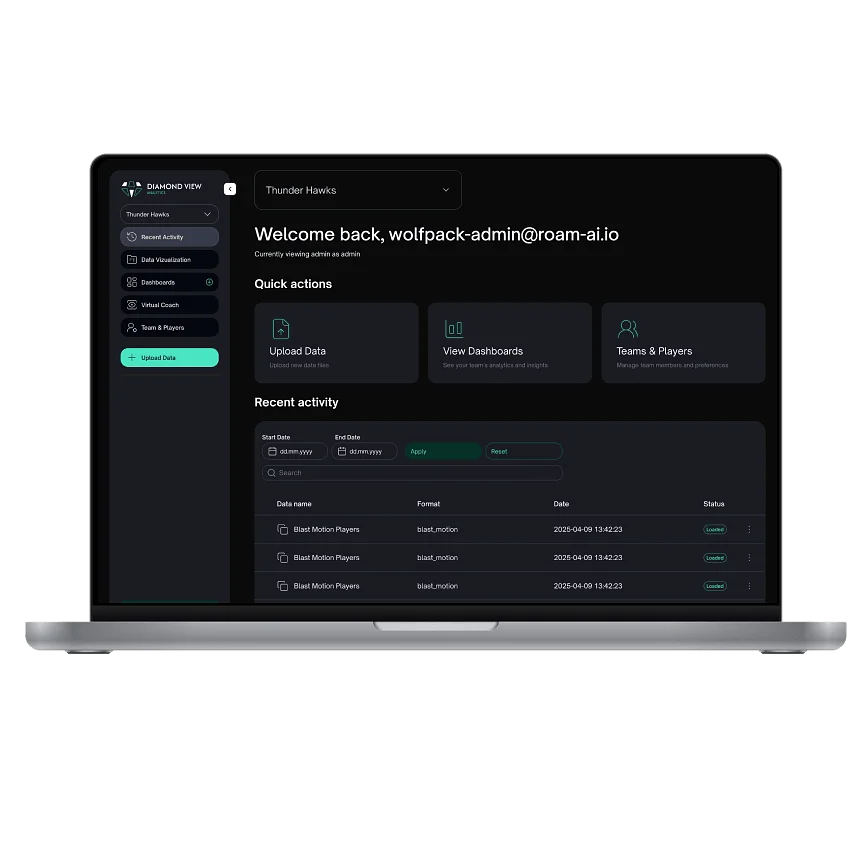

Diamond View Analytics is a web platform for baseball performance analysis. Coaches and analysts upload game and sensor data, explore it through visualisations built for the sport, from strike-zone breakdowns to 3D pitch paths, and ask a built-in AI coach what the numbers mean. Role-based team management keeps admins, coaches, and players each looking at the views meant for them.
Baseball is the most measured sport there is. Sabermetrics has turned every pitch and swing into data, covering launch angle, whiff rate, chase rate, spin, release point, and hundreds of other statistics, and sensors on bats and around the field keep adding more. The numbers exist; reading them is the hard part. A spreadsheet of chase rates doesn't tell a coach where a pitcher is missing, and a player scrolling raw stats can't see what to work on next.
The product challenge was to turn that data into pictures a baseball person recognises. That meant building visualisations around the sport itself, the strike zone as the pitcher and the catcher each see it, the field from overhead and from the side, the flight of a pitch from behind home plate, rather than settling for generic charts. It also meant serving three different roles, admins, coaches, and players, each with their own permissions and views, and keeping chart-heavy dashboards fast while they render dozens of visualisations over large datasets.
Wolfpack Digital designed and developed Diamond View Analytics as a web platform, working from a maintained Figma design source and iterating with the client in weekly sessions. Data comes in through CSV uploads and a third-party bat-sensor data source, is mapped onto the platform's sabermetrics model, and lands in a recent-activity ledger where every uploaded file can be reviewed, downloaded, or removed.
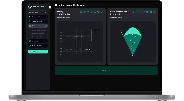
The heart of the product is its chart library: more than 20 visualisation types spanning baseball-specific views, strike-zone charts from the pitcher's and the catcher's perspective, home-plate plots and heatmaps, a full-3D pitcher-release visual, a behind-home pitch-path view, and overhead, side, and six-quadrant field views, alongside scatter, radar, bubble, area, bar, heat-map, line, and speed-dial charts. Pitching and hitting each get a dedicated game-analysis section, with metrics like whiff rate, chase rate, and frequency built into the strike-zone player analysis. Users compose these charts into configurable dashboards with per-chart settings and filters, and an API-level cache keeps the canvases responsive as they grow.
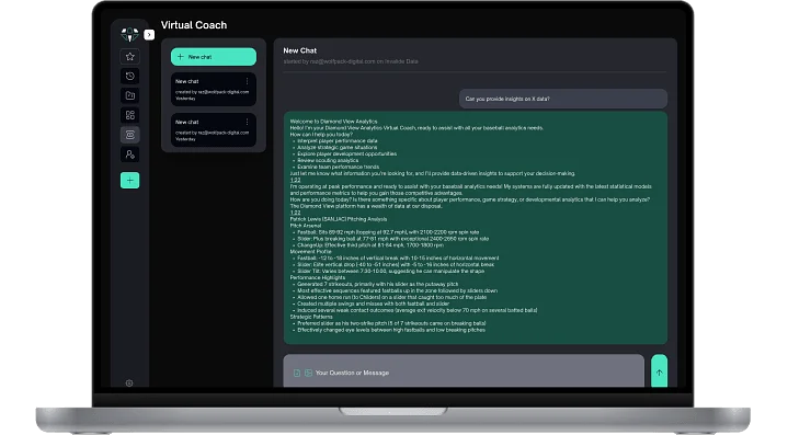
The Virtual Coach runs through the analysis experience. It is a conversational AI that users open on a selected chart, so the conversation starts from the exact data on screen; it accepts file uploads, keeps a paginated history of past conversations, and can be switched on or off by an admin for the whole platform. A guided onboarding tour introduces new users to uploading data, building a dashboard, and the coach itself.
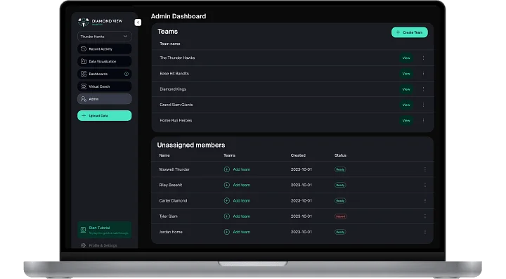
Teams and players management underpins all of it. Admins, coaches, and players each have their own role, with permissions controlling who can build and delete dashboards, who sees platform administration, and which team's data a user can reach, so a player sees their own performance while a coach works across the roster.
For Irish customers, Corrib Oil combines the ease of managing energy product orders with the perks of a rewarding loyalty program—all accessible from a modern, user-friendly platform. Whether placing an order or tracking loyalty points, Corrib Oil's solution offers a streamlined and efficient experience.
web app
iOS & Android apps
transportation
e-commerce
ireland
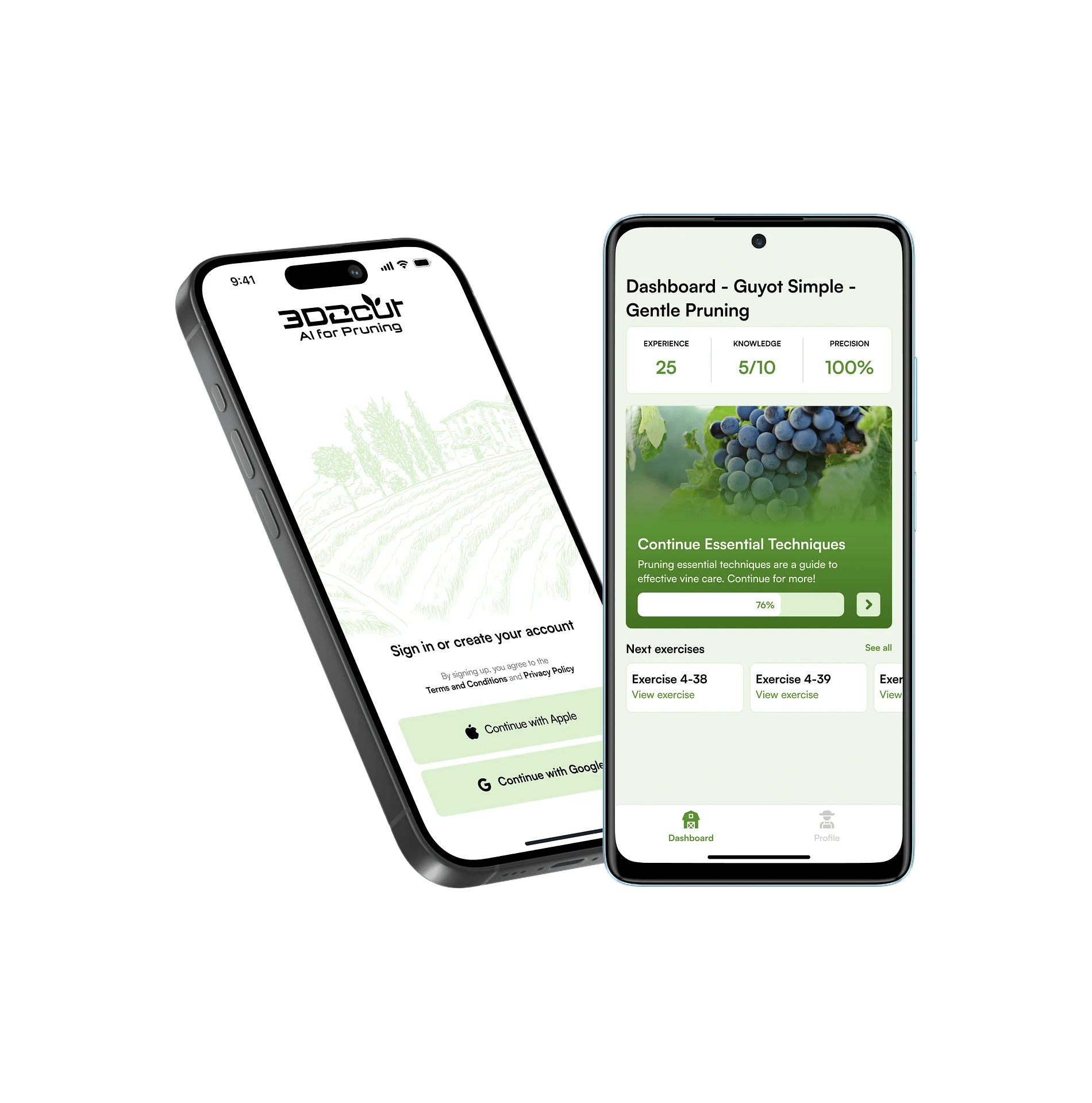
3D2cut is an AI-powered iOS training app that helps vineyard workers learn and practice vine pruning through guided courses and interactive simulations. Designed for professional agricultural use in Switzerland, it enables consistent, mobile-first skill development beyond seasonal and on-site training constraints. The app combines visual pruning exercises, immediate feedback, and progress tracking to support structured, repeatable learning.
mobile apps
iOS app
AI

Cookies
This website uses cookies to ensure you get the best experience on our website.
For more information read ourprivacy policy.