Jetpack Compose: Android's Declarative UI Framework Explained

Vica Cotoarba
Head of Engineering
Reading time: 4 min
Published: Aug 31, 2021
Key takeaways
- Jetpack Compose is Android's declarative UI framework, built entirely on Kotlin.
- It moved from Alpha (August 2020) to Beta (February 2021) to a stable 1.0 launch on July 28, 2021, and has matured since.
- Compose builds the UI from your data: when the state changes, the framework redraws the interface for you.
- It is backward compatible down to Android 5.0 and shares one language for UI and business logic.
- Today Compose is stable, production-ready, and Google's recommended standard for new Android UI.
Android has a declarative UI framework of its own: Jetpack Compose. It first hit version 1.0 in July 2021, and it has grown a lot since then. Remember our articles on declarative UI and SwiftUI? This is Android joining the same club.
Android development is more than ten years old. In the early days it was simple: XML for the interface and Java for the business logic. Over time it evolved in many ways:
- New XML layout types appeared, such as ConstraintLayout.
- Kotlin gained support in 2017 and became Google’s recommended language in 2019.
- Android Jetpack arrived and improved development in many areas.
Jetpack Compose timeline
Jetpack Compose grew through several stages before its stable launch.
The first version, Alpha 1.0, arrived in August 2020. Google called it their new UI toolkit for building native apps with Kotlin. They combined three key elements into the framework:
- Modern APIs, like other Jetpack libraries.
- Kotlin.
- Declarative programming.
An alpha version is good for experimenting, but it has drawbacks. It can contain bugs, and the APIs are not locked, so anything you learn might change later.
The next step is the beta release. For Jetpack Compose, that came in February 2021. The big win over alpha is that the APIs were locked and would not change in the stable release.
Jetpack Compose 1.0 then launched on July 28, 2021. Since then it has kept maturing. Today Jetpack Compose is stable and is Google’s recommended standard for new Android UI, and Google’s own sample apps, guides, and libraries are Compose-first.
Pros and cons of Jetpack Compose: technical considerations
What does Compose actually change? In the old imperative style, you built UI in XML and linked the changing parts to your Kotlin code. Tools like Data Binding, LiveData, and ViewModels made this smoother, but the paradigm stayed the same.
Compose builds the UI from your data instead. You write functions that turn data into a UI hierarchy. When the data changes, the framework updates and redraws the UI for you. You do not trigger it by hand. Pretty cool, right?
This idea is not new in mobile. React Native, Flutter, and SwiftUI all work this way. Is Compose better? Not always, but it is well worth trying. It is also backward compatible down to Android 5.0, something SwiftUI cannot match.
Compose is built entirely on Kotlin, which brings two clear wins:
- Your UI and business logic share one consistent language.
- New developers can learn Android faster, since they focus on a single, concise, and expressive language.
The core idea is to use composables to build your UI. A composable is a Kotlin function with the @Composable annotation, and it has no return value. As the name implies, you compose small pieces together to build complex screens.
Enough theory. Let us look at some code. 👇

First, your activity class extends ComponentActivity. Then, inside onCreate, you call setContent to load a composable.
Android Studio also generates a theme for new Compose projects. Inside that theme, you load your main composable. In our case, that is MainScreen.
MainScreen is a composable function that takes one argument. For this example, we added a Scaffold, a basic Material Design composable, that holds a Column so items stack one under another.

The Column arguments are modifiers that set size, background color, and arrangement. We also keep a boolean called expanded that holds the greeting state. A click on the Column flips it. We then show an image and a greeting that appears or disappears based on that value.
To draw a gradient background, we created an extension function on the Modifier class. That again shows the value of using Kotlin for the UI.

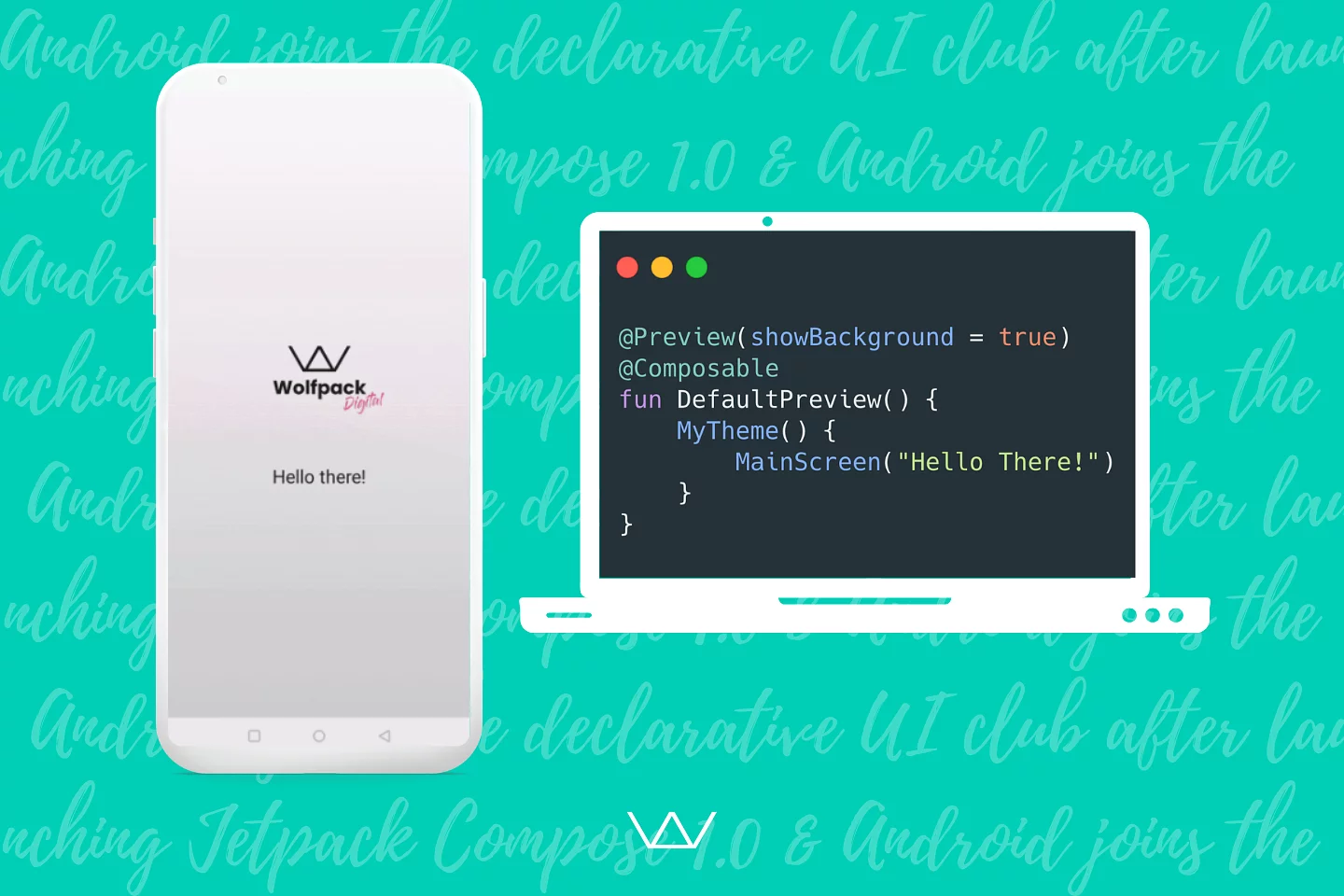
To preview our work, we add the @Preview annotation to a new composable function.

That shows a static preview of the screen.
Finally, here is a short clip of it all working together. 🙌

Is Jetpack Compose ready for production?
Yes. Compose is stable and production-ready, and it powers new Android UI at Google and across the industry. When Compose first launched, we recommended a short trial period on any brand-new framework. That caution paid off, and Compose has since earned a firm place in real projects.
Innovation is one of the keys to success for any software development team. At Wolfpack Digital, we love trying new technology while keeping a balance between excitement and stability. That is how we deliver reliable web platforms and mobile apps every time.
If you want to design, develop, and launch an Android mobile app, let us know in the chat. We will guide you through the entire mobile app development process and build a flawless application for you.